Wednesday 26 October 2011

Self Promotion

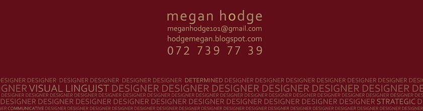
There's more to me than meets the eye. My initial aim was to drive people to take a closer look at me and my designs. That at first glance you may not realize the amount of idea generation or meticulous detail behind the actual design whilst at the same time revealing the fact that I’m not just your typical designer. There is more to me than just the occupancy title of me being a Graphic Designer, I wanted to set myself apart from other designers by revealing more about me and my work ethos. To accomplish this task I my initial thought was of UV printing, whereby my card would be very simple and type structured with merely just my details on it. But when you looked at my card under a florescent light you would see the 'more' to me and my work ethics. I then realized that UV printing wasn’t the answer, due to price constrictions. I then explored the route of gloss on Matt printing, followed by vinyl sticker cut outs. It was at this point that I realized that my concept was slightly controversial and had to find a means of revealing the more whilst keeping it visually hidden. That’s when I came up with the idea of using repetitive type. On first glance you may not notice it, but have revealed various traits about my work ethics in the type.

The whole Idea of my corporate Identity relies on the viewer at first not realizing that at the type in the bottom of item although it may seem repetitive at first glance, more traits about me and my work ethics are mentioned. 

My Corporate Identity

Thursday 22 September 2011

Ijusi Ball point pen, Issue 25

This was published in the Ijusi Ball point pen issue in 2010.  Danielle de Bruyn and I worked together on this. It depicts the idea that all we see are colours when tragedy occurs, we don't spare a thought for the people involved in the tragedy. That we as humans have become immune to hurt and tragedy due to its regular occurrence in our lives. 


Ijusi Piece 2010

Monday 19 September 2011

Jislaaik, you're in an african kitchen!

We were asked to design and illustrate an african cookbook. The essence of my cookbook is that it highlights the unique quirks of an African kitchen. It depicts the things that we have become accustomed to, that non South Africans would find it hard to relate to. Much like a guide to surviving the humor of an African kitchen. Each of my chapters are written in a humorous poetic style giving the book another uniquely interesting facet. 

What to expect in this cookbook:

Welcome to SA! You will find
That if you’re ever in a bind,                                                     


This book will be just what you need,                                                    
To cook when you’ve got mouths to feed.                  
During world cups, braai times, jail or crime,                                           
Each meal of yours will taste sublime.                         
Load-shedding? Tokoloshes? Muthi curses?                                                
Hijacked cars or stolen purses?               
Don’t be fearful, don’t you worry!        
You’ve got this book - you won’t be sorry!                        
We’ll help you cook when times are tough.                                                       
Our food’s too good to have enough.        
And so, our claim, without hesitation:        
We’ll help in any and situation!

Tuesday 30 August 2011

Illustrated Editorial Piece

Puzzled

The article I chose to illustrate revealed a side to hipsters and hipsterdom that is often overlooked. People often look at hipsters and feel as though they are totally unique, controlled by nothing, unphased by the ‘hots’ and the ‘nots’ of society and the media. That they enjoy life to it’s fullest and are able to truly like and enjoy something with no thought as to whether it’s determined by the media to be cool or not. However Oliver Roberts article describes hipsters in a different light, as though they are fickle and temperamental (as soon as something becomes in fashion they drop it and go on the hunt for the next innovative and completely unique item), that they are just as controlled by society except they hide it. I chose to then explore this irony in my illustration and was able to develop it further into a concept. I felt that the life of a hipster is almost like a board game, whereby the hipster is the piece or the token you use to play with and the media/society is the player of the game where they are able to control the likes and dislikes of the hipster. This then led me further along to the idea of a puzzle that the hipster subconsciously is being pieced together by society, which is resembled through my puzzle pieces and Tetris. The layout style I felt would enhance my illustration because there is quite a lot of detail in my puzzle pieces so a more elegant and simplified layout style would automatically create a desired focal point and enhance my illustration.


Double Page Layout


Single Page Layout


Packaging

Tea Time Treats ( Five doughnuts, Woolworths ) 

The brand of doughnuts I chose to represent was Woolworths; I felt that the simplicity and the sophisticated elegance of their packaging design would be more than suitable for my design. I also felt that their target market, being of the almost upper class, would make my doughnut packaging be of more value and use. Woolworths also has a very definite style as does my packaging design and i felt that the two designs compatibly would create a solid and unique solution to the brief.

The ease of use of my packaging has made Woolworth’s doughnuts not only easy to serve and pack but is a pleasurably authentic package design. However its main reusable function is as a tea tray/serving platter or as a plate for the doughnuts and other Woolworth’s products. The economical advantages of my design involve the inside of the tea tray, it contains serving suggestions of other Woolworths products, this will hopefully entice the person whom bought the doughnuts and their guests to hopefully purchase some of those serving suggestions, possibly even to purchase and place on the serving tray alongside the doughnuts for the event. The entire package has been made up of cardboard and plastic henceforth allowing for recyclability. My packaging style is unique and innovative and the design on the package complements the Woolworths style whilst remaining fresh and unique. My intention was to innovatively use Woolworths current style to create a new look for my packaging, whilst it characteristically  has Woolworths written all over it, its simplicity, class and overall design will bring a fresh look to Woolworths range of designs. Cost effective wise is simple to print, the design overall is quite repetitive throughout the package and will allow for simple printing techniques. Woolworths original package design didn’t provide an all round protection for their doughnuts as the one 90 degree angle of their box was clear adhesive. This provided no protection for that segment of the doughnuts and although yes viewing the doughnuts is of importance, no one likes squashed doughnuts, a compromise of the two must be made for an effective package design. 

Staff Usage

STEP 1: Lay the box flat. 
STEP 2 : Pull the stopper through the centre, twist and stack the  doughnuts  gently one on top of another. 
STEP 3 :pull the ribbon on the side. fasten the press stud and tie it into a bow and then place the lid on and the customer is set to go.

Consumer Usage

Step 1 : Remove the lid. Untie the bow and fasten the press stud on the larger setting, to allow the dish of the package to sit at an angle. 
Step 2 : Take the doughnus off the pipe and lay them out on the tray, decorate the tra with some of Woolworths other delicious teatime items.
Step 3 : Once you have eaten the scrumptious treats, merely wipe down the inside of the packaging, pull on the ribbon and it mat be used decoratively or reused as a serving platter. 


Front Design
Birds Eye View


Inside and my hand made doughnuts


Rheumaphlex ( Arthritic Vitamins and Dispenser)


The name Rheumaphlex was derived from the two terms Rheuma which is a medical term for joints and bones (rheumatism) and phlex, a homonym for flexibility.  Rheumaphlex medical dispenser allows for an easy daily dosage of your five arthritic vitamins. It is able to make taking your Rheumaphlex medication a breeze. 
The innovative punch design allows for the patient to take one of the daily medical pill strips and place it into the punch and press. Once they have pressed down on the back of the punch they simply pull on the 45 degree angled pipe lever and the tray will slide out the bottom allowing easy access to the pills. Arthritic patients have little control over their joint movements which means that a simple method requiring something other than making them grip something to have access to their medication was needed. That’s when I realized that although they may not be able to have much movement they still would have some of their strength allowing them to use the punch. The previous dispenser was a container, a child proof container, which was difficult to open even for people without arthritis, never mind a person battling with it.  My intention was to create a portable, flexible, simple and easily accessible dispenser for arthritic patients, so as however bad the patients arthritis is taking their medication for it, is one less hard task at hand.

Rheumaphlex is a reusable punch and even in some cases may be used to open other pill sheets. Rheumaphlex allows for patients to purchase the refill kit if they have purchased the punch already. The refill kit holds 90 pills, 30 pill sheets with each holding five pills, whereby one pill sheet a day will be used. This will also help the patient to remember how much medication they have taken and show them how many more they still have to take.


3D Box construction


Dispenser and Directions


Technical drawings of Dispenser


Thursday 16 June 2011

Photography and Image manipulation


The following brief relies heavily on photographic skill as well as photo manipulation. The brief required that we would organise and orchestrate a professional conceptually driven photoshoot. We had to base our photoshoot on lyrics from a song or an entire song. We then where required to make the lyrics become visual , i.e. The photoshoot. The photoshoot had to be strongly conceptual and tightly related to our song. We had to take care of the arrangement of equipment, props, location, styling and models. We were then required to incorporate type into our photographic images alongside image manipulation, whether it be a series or a single still image.

The lyrics I have chosen to base my photoshoot on came from Fiona Apples song called tymps ‘ ...the red isn’t the red we painted , its just rust...’ From these lyrics I decided to do a series of two photos, similar in nature yet completely different in meaning. The colour for red for most resembles love, passion, lust, desire yet at the same time its a very bold and brash colour resembling hatred, anger ,resentment, revolt and disgust. This then made me look into ways of interpreting these two notions of red into todays society. This then lead me to the idea of prostitution. For the prostitute the colour of red will symbolize hatred, disgust, anger etc, Yet with regards to the man the colour red is a symbol of love, comfort, enjoyment, lust etc. I then took it a step forward and applied it to the following lyric, ‘its just rust’ this resembles the decaying of their souls and memories , almost the decaying of their spirit and childhood memories. The degradation of their mind, body and soul . As they evolve further into this world of both love and hatred so the decaying spreads and increases as rust would. To accomplish this concept visually I needed to do two photos, resembling firstly how they wish they were, or more so how he wishes they were and secondly how they actually are. The initial photo will be a warmer toned one, resembling love, unity and peace, like a happily married couple would be. The second would show the emotional rotting and rusting of their souls, i.e. How they actually are. Just a prostitute and a lonely, perverted business man whom is accustomed to paying for what he wants, his own tasteless dissatisfaction.

 
'The red isnt the red we painted ...'


'... it's just rust.'


Corporate Branding and Campaigning

My interpretation of the brief is for us to take a stand in what we determine to be ethnically right , as to whether we want the Durban Point small craft market to be erected or not. The creation of a Corporate Identity, typeface, brochure and campaign would help us to realize the vastness of designing and campaigning for a company. It incorporates the more traditional style of design such as the corporate identities and logo designs alongside the more creative attributes to this project such as the campaigning and typeface. It allows for research and the development of ideas. 


Durban Paddle Ski Club Logo

Go Blue campaign Logo


Final  Corporate Identity
  
The Go Blue campaign originated from the world wide established  Go Green campaign. The term Go Green refers to saving the planet, the earth from the environmental hazards that we as humans create. Go Green’s manifesto is to reduce, reuse and to recycle in order to achieve their goals of preserving the earth and to slow down the effects of global warming. Go Blues primary target is to focus on the ocean. To save Vetch’s beach. To conserve, reserve and preserve Vetch’s beach. To conserve means to keep something in a safe or sound state; to save and protect. An explanation for reserve deters to keep in store for future use; to with hold from present use for another purpose or time or to retain. The definition of Preserve means to keep or save from injury or destruction; to guard or defend from evil, harm and danger. From these words I was able to begin exploring various aspects to my campaign.


Campaign Poster and billboard signage

One of the most vital aspects to my campaign revolves around painting the town blue. I wanted to depict how easily and almost how much fun it would be to get involved with painting the town Blue, somewhat how when you’re going for a fun night out on the town you would refer to ‘painting the town red’. Conserve refers to the beach, reserve refers to the water and preserve refers to its heritage. and DPSC of Vetch’s beach.


Leaflet